Friday, 13 June 2014


1.What two conventions have I used & Why?
Conventions are: Mix of content, Aspiration tone, Direct mode of address & model or celebrity on the front cover.
2.What are the effects of my Layout, Typography, Colour choice and Language Choice
Effect means what does it say to the audience. Essentially you need to talk about the connotations of all of these things.

Layout - Is it symmetrical (ordered and sophisticated) or asymmetrical (chaotic and youthful). What Balance does it have? (refer to your past work on balance)

Typography: Is is serif or sans serif? Does it cover hand writing?

Language: Have you use exlamatives (exclamation marks), alliteration (multiple words with the same letter), imperatives (a command) or a pun (a funny play on words)?

3.What issues of representation have I presented?

Issues are potential problems that can be seen by the representation that you have presented. 

The Magazine is a lifestyle, the most obvious give away of that would be in the MastHead, 'Easy Living'. The model, Kylie Monogue is well known for being a singer and as time goes on she is starting to get a little old, so having her as a model could engage readers to know were she is now, one of the cover lines is 'Kylie Monogue, 40 and Fabulous.' this would really engage readers to know what  is her secreter to looking 'Fabulous.' 'What You're Friends really think of you.' this cover-line is a Form of Direct address with words such as 'You're' and 'You' are words aimed at the reader so they can feel as if they're being spoken to.  

The Magazine uses a very bland colors for the font of the cover-lines are very bland and boring this could be considered to for feel the stereotype  of life style magazines which is a bland and boring magazine, they may have done this because it helps readers or buyers recognize it is a life Style Magazine. The fonts are normally big when the use of Direct Address is used, so it is almost shouting at the readers.

  
One issue of the representation 


Thursday, 24 April 2014

tHE CONVENTIONS of the magazine would be the use of direct address, the picture shows a female showing direct address this leaves the reader engaged as if the picture is aimed at them. As a Actress is on the picture it might leave readers curious to know what going on in her life.

The font varies a lot but all fit in to the genre of the magazine, The title is red with a white font, this is appropriate to the magazine as the it is called 'Red'. The messages are normally starting with 'your', this displays the use of direct address which will engage readers and leave the message being aimed towards them. The font is san serif which gives readers a first impression that it is a dun magazine. The font is informal at times 'Pj's' This leaves the reader conformable and understanding about the language.


Thursday, 13 March 2014

This is my Magazine Cover, aimed at Teenager Girls, From the age of 13-15.
I have attempted to use Feminine but teen affect with my font choice.
WWW: mY Font was  a good authentic teenage font, The Main Image represents female as it's a women as the Main IMage.

EBI: Usually I Would need more fonts but with My Magazine  it Works Fine.     

Thursday, 13 February 2014


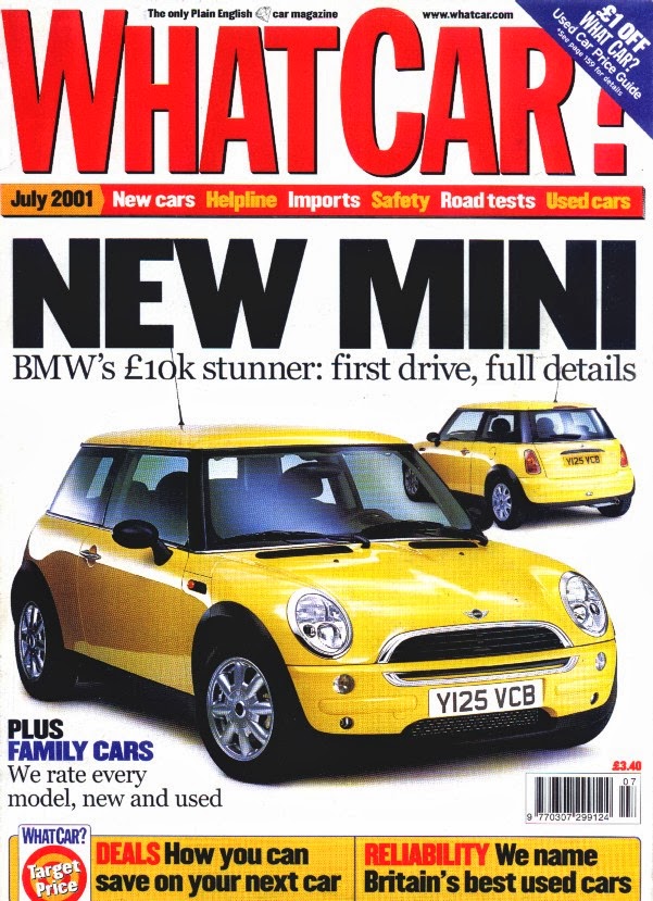
tHIS IS a car magazine called What Car? 
The title is red suggesting it is bright, full of energy and engage readers.
The Back round is white which is quite bland but can make other colors more engaging.
The Cover-line is Bold, Black and Big it is about the same size as the tile suggesting it is the main topic of the magazine.


This is a film review magazine called Empire.
The title is red, Big and Bold suggesting it is appealing to film lovers.
The Background  is a dark blue suggesting the background picture is dark 
The Cover-line  is big but not as big as the title.


This is a food magazine called fine Cooking.
The title is blue and big appealing to food lovers.
The background is bright suggesting it has a light energy.
The cover is big and bold making readers appeal to there magazine.

Thursday, 6 February 2014

Colour Connotations in magazines.


Different colors can convey  different meanings or connotations to the viewer.

Sport: Red because it is a sign of 'physical energy, Vitality, Stamina, Grounding, Spontaneity, Stability and Passion' these all represent sport suggesting sports fans will be interested in a red sports magazine.
Gaming: Yellow because it could indicate a bit of logic and creative engaging gamers to buy there magazine.
Ponies: Green because it means harmony, balance and love brining pony lovers interested in their magazine.
Bakery:  

Friday, 31 January 2014

i'M GOING TO MOVE MY MAIN IMAGE DOWN AND MAKE MY TITLE MORE VISIBL;E.
i WILKL MORE COVER LINES.

Monday, 20 January 2014

Cover lines for a teenage girls magazine.
. Popularity is catching.
. How to impress a boy.
. Become the new the cool.
. A boy's hidden secret.
.  Discover the real One Direction.
. Teenage tips.
. Lose your stomach.
. Become the girl of your dreams.
. Make fashion your passion. 
.  Men can't resist 

Thursday, 16 January 2014


Modern: I chose 'Amazdoom' because it represents  gaming which is modern to newer  day society.
Kids: I chose the font Besttoies which looks a lot like a nursery school font for kids.
Sport: I chose this font because it is seen on various amounts of american football jerseys which is sporty.

Thursday, 17 October 2013

these statements are identifying that women are in some ways slaves to men, they enter a business that intends to  pleasure men and men alone. A lot of women chose to go into the businesses for fame or for money and the rare case of trying to get near the artist. Women are often used to act sexually by video directors to get more people to view or inspire to the video, they can also try and gain profiting in advertisements. Theses videos have raised a lot of eyebrow's to the older viewers; it has cause them some concern on weather the younger society will take notes and copy these explicit videos. It has also raised the thought of younger men being brain washed into thinking that it is okay to treat women as if  it is okay to touch and talked to them like they do in these video's. Women are being used like this more frequently in the music industry which is causing wrought over sexism appeals, this is not how music intended to end up like.


Thursday, 10 October 2013


Ben and adam powerpinont from BenPaterson

WWW:   People thought our presentation had good description, good detail, our points were very clear and easy to understand.

EBI: After finishing people thought that we could of been clearer and spelling could been better.

Wednesday, 9 October 2013

iframe src="http://www.slideshare.net/slideshow/embed_code/26940555"; width="427" height="356" frameborder="0" marginwidth="0" marginheight="0" scrolling="no" style="border:1px solid #CCC;border-width:1px 1px 0;margin-bottom:5px" allowfullscreen> </iframe> <div style="margin-bottom:5px"> <strong> <a href="https://www.slideshare.net/BenPaterson/ben-and-adam-powerpinont"; title="Ben and adam powerpinont " target="_blank">Ben and adam powerpinont </a> </strong> from <strong><a href="http://www.slideshare.net/BenPaterson"; target="_blank">BenPaterson</a></strong> </div> 

Benjamin Paterson 

Friday, 27 September 2013

1) How to insert an image- Click on the file menu, then select open, It will then display a dialogue box, in that click browse to search for your image, after selecting it click okay, the selected image will be added to your photo shop, continue opening many files.
 
 
2) 
Select the Eraser tool 
Set the background color you want to apply if you are erasing in the background or a layer with locked transparency.
In the options bar, choose a Mode setting. Brush and Pencil set the eraser to act like those tools. Block is a hard-edged, fixed-sized square with no options for changing the opacity or flow.
For Brush and Pencil modes, choose a brush preset, and set Opacity and Flow in the options bar
An opacity of 100% erases pixels completely. A lower opacity erases pixels partially. See Paint tool options.
To erase to a saved state or snapshot of the image, click the left column of the state or snapshot in the History panel, and then select Erase To History in the options bar.
Drag through the area you want to erase.

Wednesday, 25 September 2013

My image  on photo shop was an eagle to make it look like it is representing a school.
It had the ravens wood colors so it can be resembled to our school. I used a various amount of different tools on photo shop, the tools were paint brush, magic wand and the gradient tool. I proceeded with my logo by using a range of different images on the internet which I copy and pasted onto my screen; I then used the images to finalize and edit. When my work was at a conclusion it turned out to be a convincing school logo.

To improve my work I would of added more detail and used more of a range in colors.      
 

Sunday, 22 September 2013

Friday:
I wake up with a droning ringing noise from the side of me, it is my agonizingly annoying alarm clock; I lazily fall out of bed and gradually walk down stairs. When I eventually get down stairs I make breakfast and read the morning newspaper. When I've finished breakfast I walk upstairs; I start to get dressed with loud music playing behind me to wake me up more. I'm now set for school. When  I've eventually left the house, I rush to my nearest  bus stop and just about get to the bus phew. As I'm on the bus I see a lot of advertisements on bus stops and other buses. I get home from a long day at school and conclude my day with entertaining TV.

Saturday:
I wake up at about 1 pm and go down stairs for breakfast. I finish breakfast and immediately go upstairs and play four hours of Fifa 13, that game never tires me. I later watch a film with the family; the film was tense and exciting but not my dads cup of tea. I am extremely tired at about midnight so I normally just listen to music till I go to sleep.